Vexillology - To Make a Great Flag For Zoosexuals
The other day I was doing some baking. I was making some bread for me and some little snacks for the dogs--to be honest they're pretty happy with my treats or with treats from the store, but hey, I like to do special things for them and the oven was going to be on anyways, so why not throw in some things for them too, y'know?
When I'm baking bread, I like to do a little decorative scoring on the top of it: all that means is, if I scratch a cool fancy pattern on the surface of the dough, then as the bread is rising and the crust is forming it will bake contrasts into the crust where it has been cut or not cut. It's almost like a tattoo, or a tree's bark growing back around a wound.
So, as I was there, oven nearly fully preheated (not that I'm a stranger to getting ahead of myself and throwing something in early, but, in this case I was being patient,) I was there looking at this smooth, floury-smelling surface on which to put something. For a brief moment, I wasn't sure. But then, glancing over at the dog treats, an idea sparked, and I giggled as I scored a four pointed star into the top of the bread, and a couple of diagonal lines.
As I was just finishing up the last line, the oven beeped, as though voicing his nonjudgmental approval of humans and dogs who like to kiss each other. I started getting everything into the oven, and I was really just thinking--and not for the first time--, "Wow, our pride flag is so good."
Like, it is, right?
Like, look at this thing:
I mean, to be clear, that is not the zoo pride flag we've always had, and it's not the one that every last zoo uses. There are a lot of variations. Some people imprinted more on one of the earlier designs, which, hey, is understandable. It was exciting news, the first time I heard we had a zoo pride flag at all. I think they only started popping up as recently as 5ish years ago. I don't know f a zoo flag existing back in like, say, the 90s, for example. Although, don't quote me on that, I have been surprised before by how old some zoo stuff is that I'd missed. We definitely had the zeta symbol to represent ourselves in the 90s, and that was used in a variety of cool ways like physical zeta pins you could wear, incorporating the zeta into your personal zoo website's design.
But like, check these out!
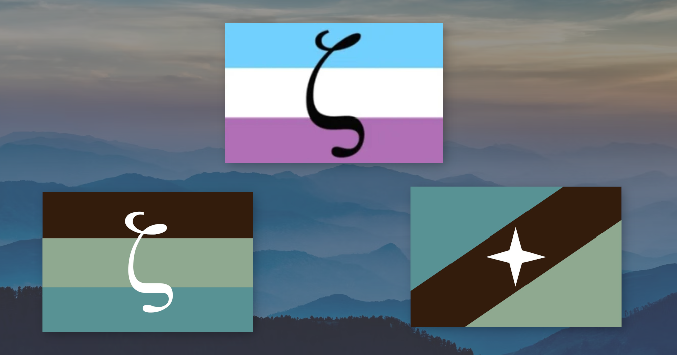
These are the main zoo/zoosexual/zoophile pride flags you see floating around, used by zoos/zoosexuals/zoophiles who want to visually put their zooiness out there in some way :3 I will note, if you're new to the topic, that zoo, zoosexual, and zoophile are basically three different words that mean the same thing. At the bottom of the article I'll include a link to a fuller breakdown on the evolution and discourse around that language if you're curious.
I think from a design perspective, the horizontal bars one do match a lot of other pride flags. I suppose just match a lot of other flags in general, like, there is not a shortage of countries whose flag is three stripes of different colors. So it makes sense why we would go with three horizontal bars design. The colors are very earth and water-y, which is certainly thematic to something involving nature. If our only tools to work with were existing pride flags and the paint bucket option in Microsoft Paint, this horizontal bars design would be a good punt at a zoo pride flag.
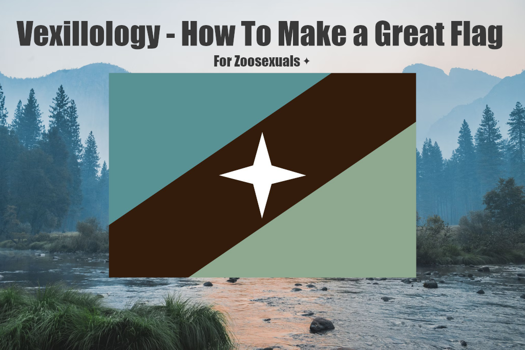
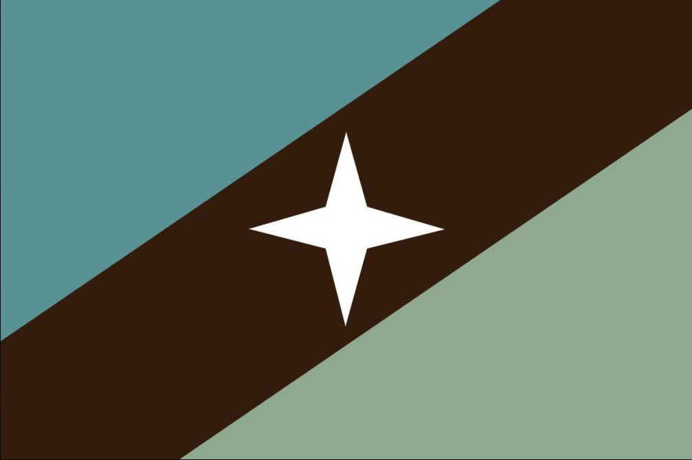
But the diagonal one with the star, in my opinion, really excels into us having kind of lowkey the best pride flag I've ever seen.
You might already know this or you might not, but there is actually a whole world of design that is specific to flag design. The fancy word for it is vexillology. Someone who is into vexillology is into the idea of making really good flags. Like all art, whether a piece is good or bad comes down to personal opinions at the end of the day, but as an art form that has found a home among nerds, a lot of guidelines have been codified as to what makes a "Good" flag or a "Bad" flag.
Basically, the "rules" you will hear for flag design are:
1) Your flag should be pretty simple,
2) Your flag should be recognizable, and
3) Your flag should have meaningful imagery.
We actually have a really official example of a flag that was recently updated with these kinds of concerns in mind! The state of Minnesota has decided that it is changing its official state flag, not starting quite yet but probably starting soonish maybe unless someone stops it.
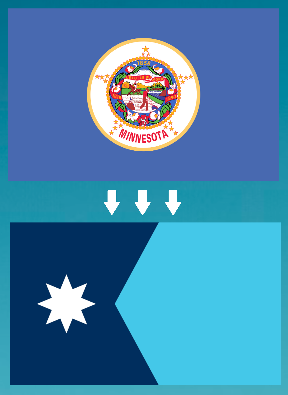
Okay so, honest personal opinions here... both of those flags suck. The current one is impossibly complicated, middle-of-the-road on recognizability, and the imagery seems to involve plowing fields and a Native American on horseback and... mountains? Does Minnesota have mountains?? The potential new flag is much more simple although really still not an achievement in simplicity, it is still middle-of-the-road recognizability for me, and I don't even have a guess as to what the eight-pointed star or the wedge are imagery for, but I do assume that the blue is for like, water and snow.
Look, maybe if for some reason I already loved Minnesota, like I love Zoo Pride, I would have more generous thoughts as far as the redesign. I will say, I did look it up after writing down my honest personal impressions above, and apparently the wedge in the new Minnesota flag is to represent the shape of the state itself, which, hey, clever, I actually do like that. The star is the north star, I still don't really know why it has eight points specifically but sure, MN do be up there in latitude. Looking into it more, I would say the new design is better than the old design, but neither is an A+ to me.
But like, seriously, check out this zoosexual pride flag.
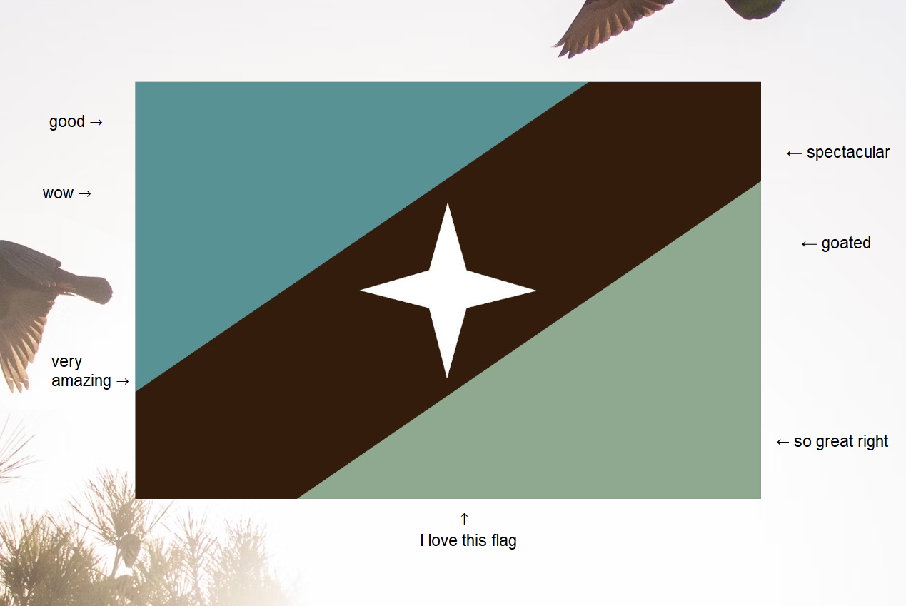
Simplicity. Two lines. One shape. I could describe to someone with words how to spot this flag, if we were trying to peep zoos at a fur con and they weren't as up on the latest zoo pride stuff as me.
Recognizability. I 1,000,000% remember how the zoo pride flag looks. If someone had it as a bumper sticker I would spot it so fast. If someone asked me to draw it from memory, I would do it in two seconds with a black pen, or take a little longer if you also gave me the colors and I got to scribble all of them in. This flag is iconic, easy to spot, easy to remember, easy to recreate.
Imagery. The colors remind us of nature, where the creatures who captivate us often live. The four pointed star alludes to our four-leggers. I mean, not to disparage dolphins, but, *a lot* of the people who zoophiles fall in love with are quadrupeds: dogs, horses, farm dwellers. The "bars" of blue brown and green are reminiscent of other queer pride flags, but by being diagonal are also set apart.
I defy anyone to name another pride flag I could have recognizably scored into my loaf of bread. One that is not too complex, one that works blind to color, one that I feel so happy to put on there.
I would be glad to wear this flag on a shirt, a hat, you name it.
I would be glad to actually fly this flag.
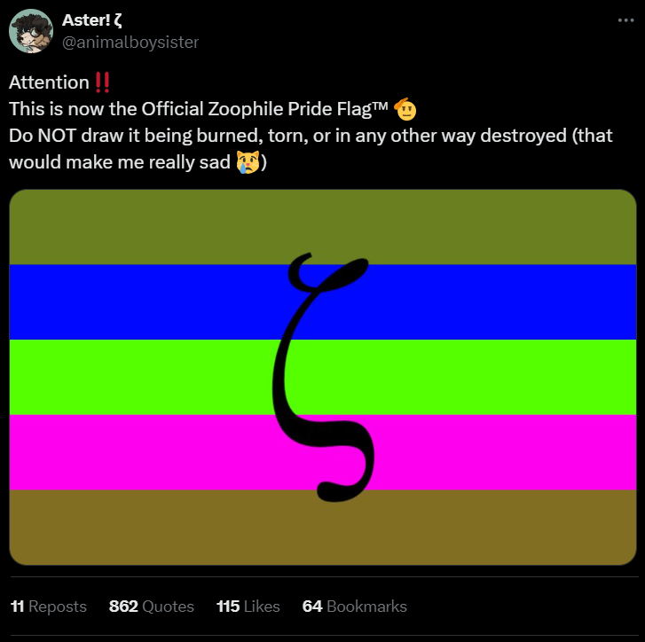
Also, I love the culture that's come up surrounding the zoo pride flag. For those who don't already know, basically, there's a running joke in some parts of the zoophile community about how people who hate on zoos will somehow find the most obscure, unused flags that hardly any zoos have ever even seen before, and then they will make art of themselves destroying this flag. This flag which, again, no one recognizes because none of us use it I don't even know how these people are finding these other obscure flags. Maybe they're ones that someone on DeviantArt made as an idea and so it came up on DeviantArt when you search "zoophile flag," that's my best guess. But, anyways, it's very funny how weak the message is compared to how much the art thinks that it's accomplishing, to the point where zoos will joke about these silly flags people are burning and ripping apart for no reason.
Shout out to Aster, who baited anti-zoos with a fake flag and it worked so hard it went viral, with quote retweets that are largely antis drawing themselves destroying this flag that, to say it once again, is a fake flag that Aster made up to bait them into destroying as a joke.
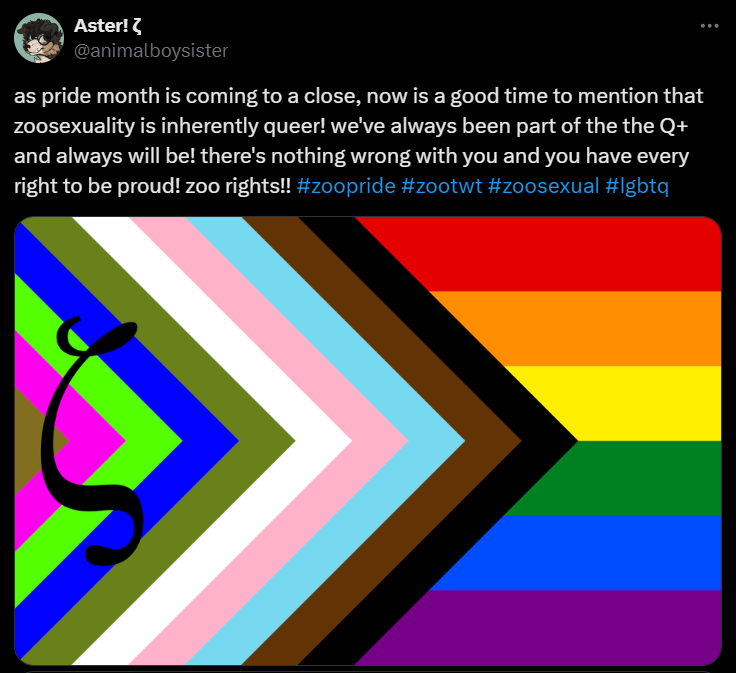
And of course, the follow up.
Overall, I love our flag. The one with the earth/water-y tones and the four pointed star. I'm very glad that we have it. I've never really felt much pride in national flags, like, I'm not someone who would ever wear my country's flag on a pin or make it my phone's wallpaper. But the zoo pride flag does exactly what it says: It's a flag, and it's a flag that I am proud of.
Article written by Alissa Dogchurch (February 2024)
Questions, comments or concerns? Check out our Discord server! discord.gg/EfVTPh45RE